Bread & Roses: Redesigning a nonprofit’s website to optimize for increased donations.
Role: Branding, UX/UI Design
Team: Individual project w/ feedback from mentor + peers
Duration: 80hrs
Tools: Figma
PROBLEM
‘Bread and Roses’ is a Massachusetts-based soup kitchen, serving over 50k meals per year to the surrounding community. Funded entirely by business partnerships and donations, they are in need of a brand redesign for their website to raise awareness of the mission, optimized for donor engagement.
Smaller non-profit organizations don’t often have the resources to pay for design services - my passion behind this redesign is to make thoughtful design accessible for a great cause!
SOLUTION
I redesigned the Bread and Roses brand and site, thinking through responsiveness from desktop to mobile, and created a simpler, more engaging donation flow. This solution was shared with the organization and while they can’t implement the full site at this time, they plan to use it as a guide for navigating their existing site to another host.
RESEARCH + DISCOVERY
Market Research 🕵🏻♂️
To kick things off, I wanted to understand how other nonprofits approach their site design and donor checkout flows. I looked at strengths and weaknesses, and thought through opportunities to differentiate.
Competitive analysis of non-profit organizations
Key Findings:
Strong, bold CTA donation buttons paired with explanation of impact were common across most sites.
Lack of CTA button color consistency left me, the user, unsure of what action they wanted me to take.
Donation amount suggestions were common across most sites.
Site Audit 🧐
To familiarize myself with the existing Bread and Roses brand approach, I combed through their site and found that donation CTA prompts are not highlighted in a way that draws attention. Additionally, the existing information architecture and site layout is overwhelming, potentially leading to low donor conversion rates.
As a preview of what’s to come, below is a side by side before and after of the homepage:
Before and after preview of the Bread and Roses site redesign
User Research 👂🏼
Now that I was familiar with existing sites and the current state of Bread and Roses, it was time to talk to real people! I put together a research plan for user interviews and online research with the following goals in mind:
Understand the philanthropy behaviors of others; how, when, and why people donate.
Identify what people know about soup kitchens and the services they provide.
Identify barriers and hesitations to giving online.
Check out the research plan and interview script.
Research Debrief 🧠
4 total participants were enlisted and interviews were conducted over the phone. Additionally, I read through existing articles/posts about building empathy and designing donation flows.
My key takeaways include:
Build empathy for donation through storytelling - donors want to feel personally connected to a cause.
Donors want transparency - how will this money be used? what direct impact am I making?
Clearly explain what we do - not everyone is aware of the services that a soup kitchen provides.
Check out raw notes from the 1:1 interviews and a full research debrief report.
“If I feel personally connected to a cause, and the service extends kindness and compassion to someone, I’m motivated to give.”
DEFINE + BUILD
Personas 👥
Following the interviews, I created user personas that reflect the three types of donors that would likely engage and donate through the Bread and Roses site:
Main donor types - fundraisers, one-time givers, and the recurring donor
User Flow 🚂
I then created a user flow to map out what steps a donor might take to make a donation. There are two entry points: direct-to-site, and another for users that arrive to the donation page through a social media link. This helped me to realize that both points of entry intersect at the donation page meaning, this page should be able to stand on its own in converting visitors to donors.
User flow with two points of entry
Pen + Paper ✏️
To kick off the sketching process, I listed out the existing information architecture and grouped categories into menu sections to make the header concise. I then created a list of sections to include in the landing page and sketched out what those might look like, with a focus on donation CTA buttons/prompts.
Brainstorm notes and initial sketches
Wireframes 👷🏾♀️
Now that I had an idea of the direction my design was headed, I used my initial sketches to create desktop and mobile wireframes. This helped me to start thinking about how this would adapt across different devices.
Homepage and donation flow wireframe explorations for desktop and mobile
Style Tile + Logo 🎨
In order to stay true to some of the existing elements on the Bread and Roses site, I chose a red-toned highlight color to bring attention to the donate CTA. I paired this with a purple tone to offset the harshness of red and provide an element of peace. I chose the humanistic font Gill Sans, to bring in more friendliness and personality.
After exploring sketching out ideas, I decided to go with a simple logo that incorporates the leaves on a rose stem, as an ode to the existing logo.
Brand style tile
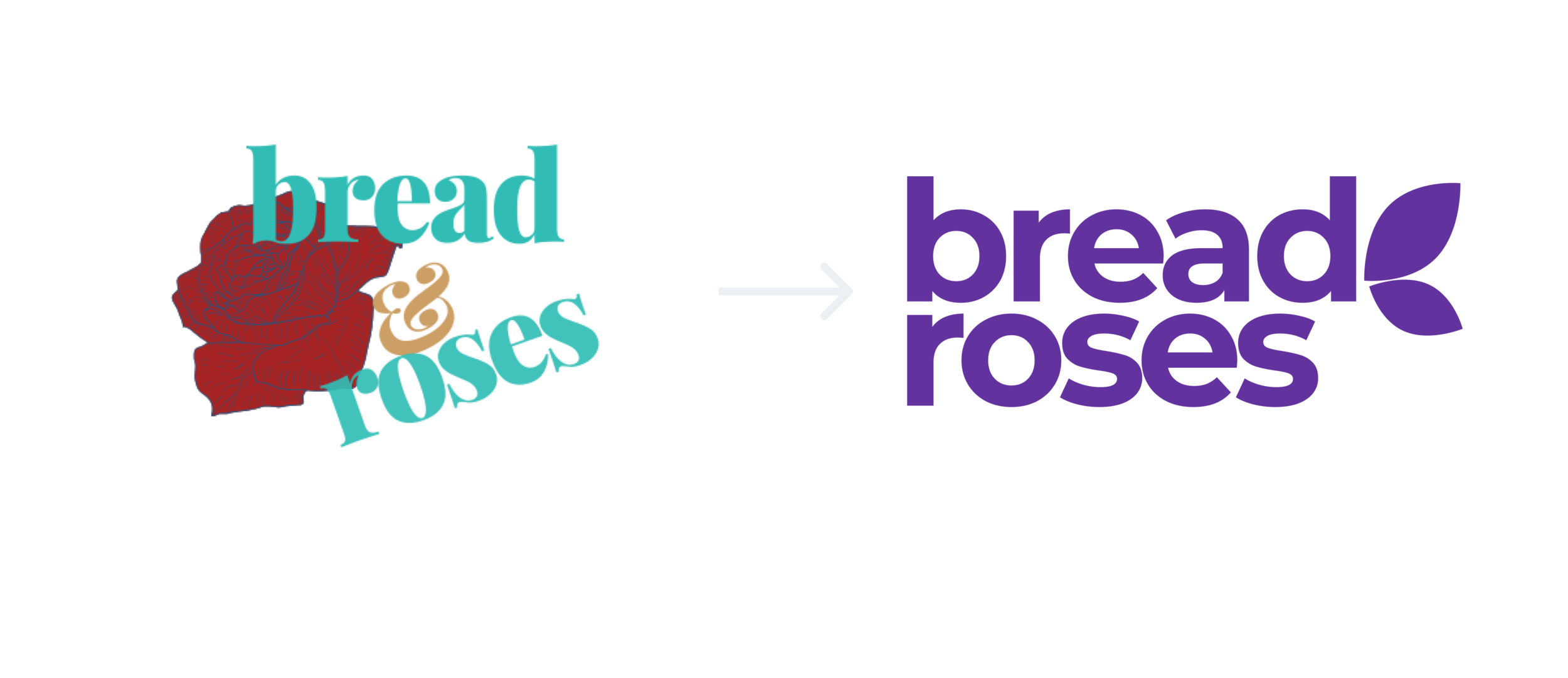
Friendlier, more approachable logo (right)
UI Kit
I documented the UI patterns and components used into a kit, so that these can be repeated for consistency as the rest of the site is built.
UI Kit for the redesign
PROTOTYPE + TEST
Feedback 🗣
Throughout this design process, I took in feedback from both my design mentor, Justin Hanson, and other designers in a weekly group critique session. The feedback loop is the part of the process I enjoy most!
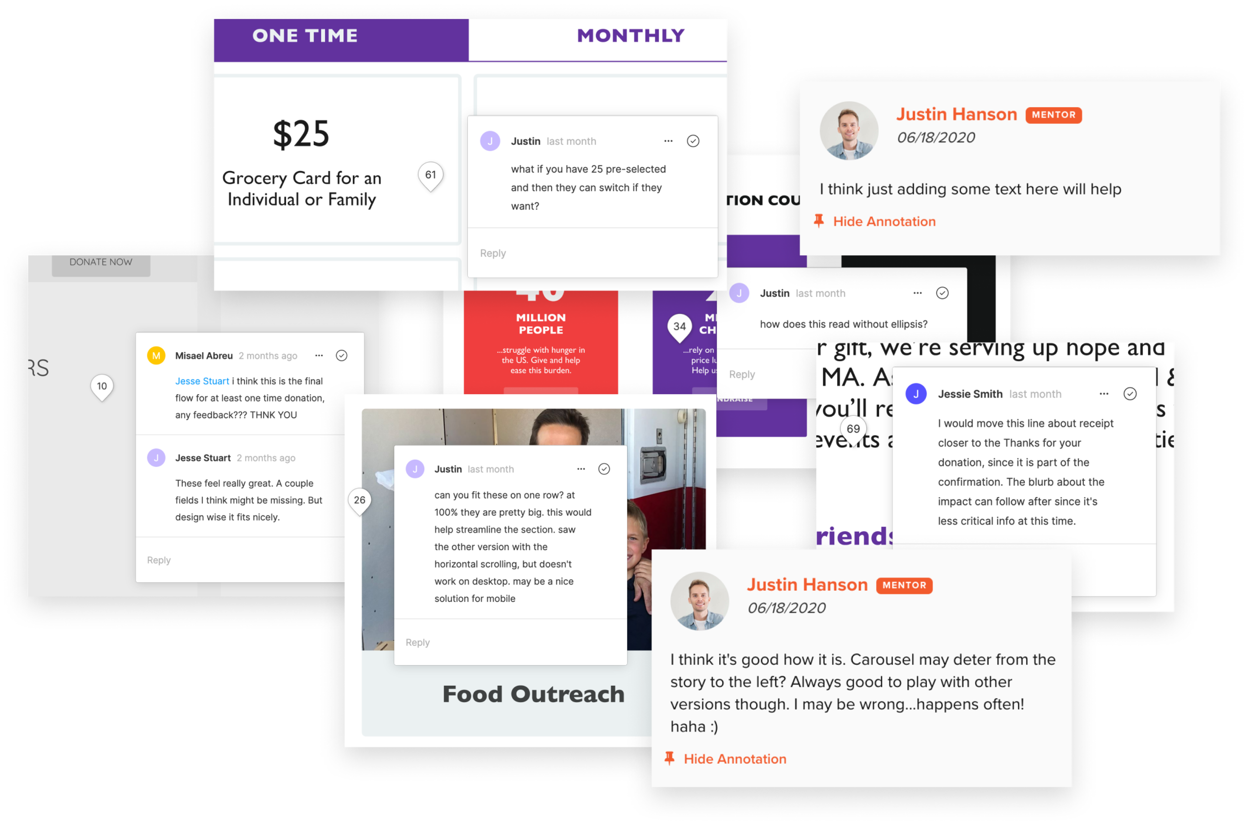
Screenshots of designer feedback on this project
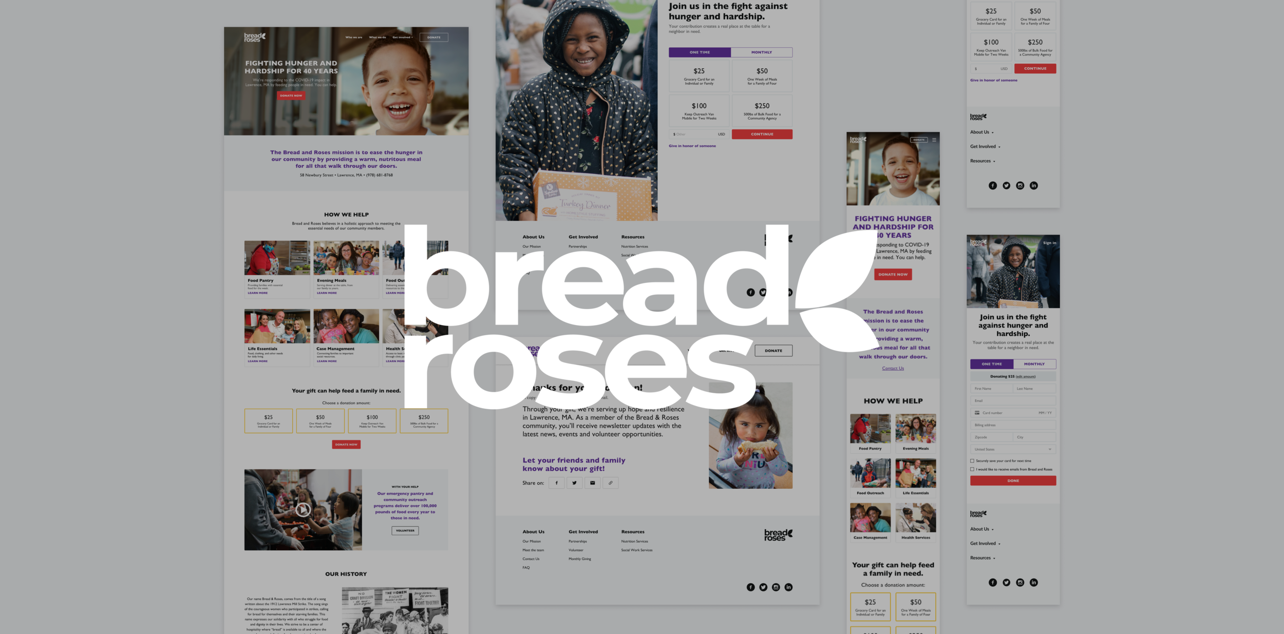
Homepage 🏠
Because several users commented on not fully understanding what a soup kitchen does, the first landing page sections highlight both the mission and programming of the organization. This paints a full picture of Bread and Roses and provides trust for going through with a donation. For the mobile version of the site, I made things responsive by designing with variable breakpoints for different screen sizes.
Homepage hi-fi mockups for desktop and mobile
Donation Flow - desktop 👨🏽💻
In order to increase donor conversion, build trust and provide transparency, I added suggested donation amounts along with explanations for what the organization can do with that money.
Donation flow hi-fi mockup for desktop
Donation Flow - mobile ☎️
With the “thumb zone” in mind, I resized components of the desktop version, proportional to suggested best-practice margins for mobile. The layout varies only slightly and can adjust based on screen size.
Donation flow hi-fi mockup for mobile
Usability Testing 📊
I put together a usability test plan to understand how users interact with the prototype and to find areas of improvement. Three participants were enlisted, and the test was conducted via video chat and screen share.
I used my test finding notes to build an affinity map, and identified top revisions to focus on in the short term:
More directions - donors were unsure how to interact with suggested donation amounts.
Increase hierarchy for contact and location information - donors weren’t seeing this clearly.
Increase trust and security - the checkout process did not provide enough legitimacy.
Add social sharing links - donors wanted to be able to tell others about the cause supported.
Affinity Map based on usability testing feedback
Prototype Revisions 🛠
Homepage revisions, after usability testing
Final donation flow revisions, after usability testing
SUMMARY + NEXT STEPS
When I began this project, I thought the existing Bread and Roses site would be straightforward to redesign. Through my own online research and user interviews, I realized there’s a lot of thought behind building empathy on a site and convincing users to move forward with a donation. With more time, I would continue iterating based on user feedback and once live, analyze conversion metrics. I would also design the full site, following the new branding pattern and layout and in the long term, seek out new ways to optimize other flows such as increasing volunteers for the organization.