Tables
Forerunner, 2024
Empowering communities with customizable, shareable, geospatial data.
Role
Senior Product Designer
Timeline
4 months to first release (ongoing iterations thereafter)
Team
1 Product Manager, 3+ Engineers
Forerunner is a platform that modernizes how local governments manage flood risk and resilience: making complex data and regulations easier to understand, share, and act on.
Overview
Forerunner helps local governments make sense of complex property and infrastructure data. But before this project, users relied on CSV exports and spreadsheets to answer basic questions like ‘which properties are missing Elevation Certificates? which inspections are overdue?’ because the platform offered no unified way to explore data. Properties acted as the single hub, and every workflow branched off from it, making it difficult to filter, navigate, or compare information at scale.
Tables were created to solve this gap. More than a new view, they established the foundation for how users interact with Forerunner’s relational data: how to slice, sort, and query across objects in a predictable, scalable way.
The Challenge
Users lacked a scalable way to explore interconnected datasets inside the product. This led to:
Duplicated spreadsheets and misaligned workflows across teams
Manual data entry for recurring reports
Limited visibility into patterns across objects (e.g., warnings across certificates)
Inconsistent analysis due to ad-hoc filtering and sorting
But beneath these surface issues was a deeper challenge: Users were trying to perform relational queries inside a system that wasn’t yet designed to support them. For example: a property may have multiple Elevation Certificates > each certificate may contain multiple warnings > warnings may point to specific fields, dates, or file attachments. Users weren’t just “sorting columns.” They were trying to pathfind across objects and relationships.
This insight fundamentally shaped the design approach. Tables needed to express how data was connected, not just display it.
The Solution
We introduced Tables in June 2024 (see media release here), creating a flexible foundation for browsing and acting on data at scale. The MVP included:
Dedicated Properties, Files, and Inspections Tables
Robust filtering, per-column sorting, and column controls
CSV export for reporting and cross-team workflows
A structured default view that enabled future capabilities like Saved Views and geospatial filtering
Tables quickly became the backbone for critical workflows across the platform, including audits, inspections, grant management, and code enforcement.
V1 release of the Table
V2, built on top of the foundational table system
Discovery and research
Rather than a long-form research cycle, we combined high-signal sources:
🗒️
Support tickets and customer conversations/recordings
📊
Internal product analytics and workflow audits
💬
Cross-functional input from Customer Support and SMEs
Key Pain Points
Audit friction: Hard to identify missing ECs or certificates with issues
Scaling issues: Filtering and analyzing inspections across many properties were complex
Warning visibility: Users struggled to see patterns and repeated compliance risks
Variable expertise: Data literacy varied widely across municipalities
These needs pointed to a clear goal: build a system that could adapt to simple and highly technical users alike.
Challenge: Mapping Data Relationships
Early in discovery, it became clear that the challenge wasn’t just UI, it was defining how far users should be able to move across object relationships inside a table. Users often needed to answer questions like:
“Show me all certificates with this specific warning.”
“Find properties where at least one EC has unresolved issues.”
“Which inspections flagged repetitive loss issues, and which were mitigated?”
Each question required sorting through 1–2 levels of relational depth, which raised important design and architecture questions:
Should Properties be able to filter on attributes belonging to deep, nested objects?
What is the “minimum path” a user should take to arrive at the correct dataset?
How do we prevent UI promises that the backend can’t fulfill at scale?
I facilitated discussion between leadership, product and engineering to arrive at a decision point here: Tables must be scoped by primary object type. This ensured:
Predictable query performance
Clear mental models
A foundation that could scale into more advanced querying over time
This was a pivotal systems decision: avoid a global table, which would imply querying capabilities the database couldn't yet support, and instead teach users where each type of question begins.
Ideation
With system boundaries defined, I explored a few directions to create a flexible, performant foundation. Explorations for filtering, navigation, and sorting/filtering included:
Filtering UX
Sentence-based filtering (“Show properties where…”)
Inline editable filter chips
Nested condition builders
We ultimately selected a nested menu system because it aligned with existing input logic, it simplified parsing for engineering, and it ensured stable, predictable queries for large datasets. This tradeoff meant that users had to clear/reapply filters intead of editing inline, but the predictability and performance benefits justified the choice.
Navigation:
A single unified “Tables” page
Dedicated tabs for each dataset
I chose dedicated tabs, giving each table type a clear identity and reducing cognitive load. This also required establishing new patterns in the system’s navigation bar.
Sorting & Filtering
After testing global sort buttons and inline chips, we landed on: per-column sorting and a dedicated filter panel. This kept the header clean and made it easier to manage complex filters without clutter.
Early explorations for Table filtering UI
Early explorations for Table action bar layout
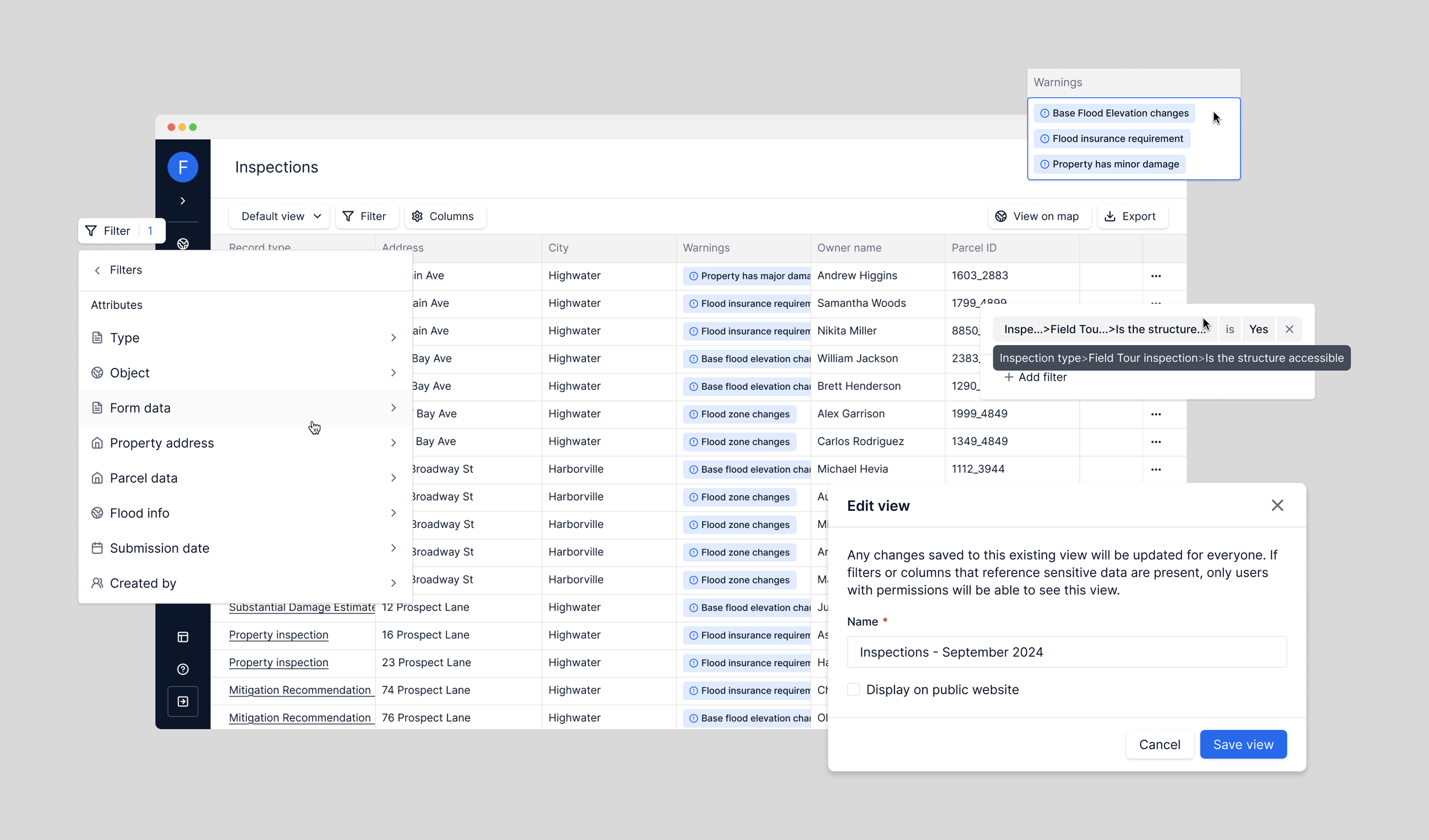
Defining the Filtering Model
Before any UI was finalized, I partnered with Product and Engineering to define the underlying filter model:
Every data type (text, numeric, date, boolean, tags)
Every operator it supports (“is,” “contains,” “greater than,” etc.)
How operators should behave across object types
Behavioral rules for multi-select and tag filters
This work established a framework that could be applied to future table types without redesign.
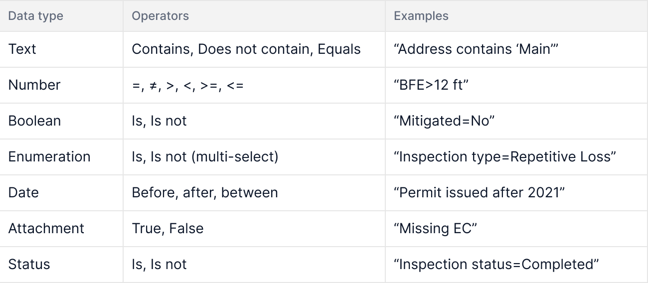
Early filtering model – mapping data types to supported operators to ensure consistency and scalability across Tables.
I validated these patterns through scenario-based walkthroughs with leadership, such as:
“Find repetitive loss inspections where Mitigated = No and created in the last 2 years.”
These exercises ensured the system held up under real-world complexity.

Filtering a real inspection dataset using data-type–specific operators.
Design Validation
Through internal demos and customer walkthroughs, we validated:
Filter panel matched users’ mental model for “find by condition”
Column picker provided flexibility without overwhelm
Sorting, export, and default views felt intuitive and fast
Feedback shaped refinements around microcopy, empty states, and Save View behaviors.
Results
📊 Adoption
92% of weekly active users engaged with Tables within the first few weeks.
📈 Efficiency Gains
Teams reduced reliance on external spreadsheets and improved data accuracy.
💬 Better Collaboration
Customer Success reported increased data literacy and stronger alignment between field teams and office staff.
Tables now power multiple workflows across the platform, far beyond their initial scope. Below is a glimpse of how Tables has evolved today, now powering multiple workflows across the platform:

A look at today’s Table experience: quickly filter, sort, and customize your data.
Challenges
Balancing power and simplicity: Forerunner users range from engineers to part-time inspectors
Performance at scale: Large municipal datasets required tradeoffs like pagination
Saved View governance: Implementing clear ownership to prevent accidental changes
Permissions: Ensuring PII and sensitive data were handled appropriately
Reflection
Tables redefined how municipalities interact with Forerunner’s data. By starting with a deliberately scoped, property-first foundation and designing a relational framework—not just a UI—I helped create a system that continues to scale across new objects, workflows, and features.
What began as a table view became the data backbone of the platform. Watching it grow into inspections, grants management, code enforcement, and task management has been one of the most rewarding parts of my time at Forerunner.