Kaus Insurance: Simplifying the insurance buying process for a younger, more tech-savvy audience.
Role: Branding, UX/UI Design
Team: Individual project w/ feedback from mentor + peers
Duration: 80hrs
Tools: Figma
PROBLEM
Kaus is a company that has been in business for 30+ years, working primarily through regional agents. In an effort to keep up with the digital age and reach a younger audience, they now want to sell their policies online.
SOLUTION
I developed a brand for Kaus and designed a website from the ground up, making insurance purchases feel more accessible and efficient for a younger audience.
UNDERSTANDING THE INSURANCE INDUSTRY
Competitive Analysis
I identified commonalities and differences between online insurance providers, took note of their strengths and weaknesses, to then create opportunities for differentiating Kaus.
Here’s what I learned:
Take it one call-to-action prompt at a time, don’t overwhelm the user.
Make it clear whether you’re a direct-to-consumer or third-party comparison site.
Information architecture and copy need to be concise, insurance is a wordy business.
UNDERSTANDING THE CUSTOMER
User Research
In order to understand the barriers and hesitations people have against making insurance purchases online, I enlisted 5 participants for phone interviews, matching the target demographic (ages 26-49, tech-savvy, working professionals). Check out the research report here.
“It’s hard to find insurance coverage in layman’s terms, and I usually end up just speaking with an agent. I just want to know monthly charge and what that’s covering.”
Here’s what I learned:
Site content is overwhelming, leading people to opt for a live agent during checkout.
There’s a lot of uncertainty around what type of policy someone actually needs (health, renter’s, life, etc.).
People want to feel like they can trust an insurance website with their personal information.
Persona and Empathy Map
I created a persona and empathy map based on learnings from user research: meet Harold - the tech-savvy dad.
Persona and empathy map exploring characteristics of the target users
Card Sorting and Site Map
To figure out the information architecture for the site, I built out a card sorting exercise via OptimalSort, with an ‘open sort’ technique, and enlisted 4 participants within our target demographic to group 30 cards into categories of their choosing. Detailed charts with sorting results are found here.
Here’s what I learned:
Common categories: Circumstantial, Home, Natural Disaster, Vehicle, Health, Life, and Personal Risk.
Least common categories: Crime, Cyber, Extra, Housing, Marine, Misc., Pets
Naming conventions should be broad and limited to 5-6 categories.
BUILDING THE USER EXPERIENCE
Task Flow and User Flow
I created task and user flows to map out structure, hierarchy, organization and relationships across site content.
User flow highlighting user entry and decision points
Task flow focused on a single pathway: the user visits the site for an insurance quote and purchase
Sketching
In my initial sketches, I explored different site layouts and shared these with other designers for feedback.
Homepage layout explorations
Wireframes
Using my sketches for reference, I created responsive wireframes for the homepage across web, tablet and mobile screens. This provided a starting point for thinking about branding and high fidelity.
There are only three wireframes here because I was iterating within the same frames. For subsequent projects, I developed the habit of duplicating screens for updates - allowing me to both share explorations with team members and showcase my own progression within a project.
Web, tablet and mobile
DEFINING THE BRAND
Logo + Style Tile
I designed a logo by focusing on three key words: trust, protection, and safety. I chose the sans serif typeface ‘Quicksand’ for its versatility/legibility at varying screen sizes and its friendly, humanistic, enjoyable feel. The brand color was chosen to represent stability and trust, important factors for considering an insurance provider. Finally, I designed the icons through the vector tool in Figma and used generic social icons otherwise.
Kaus logo, representing safety and protection
Typography, color, icons, and buttons
BUILDING THE PROTOTYPE
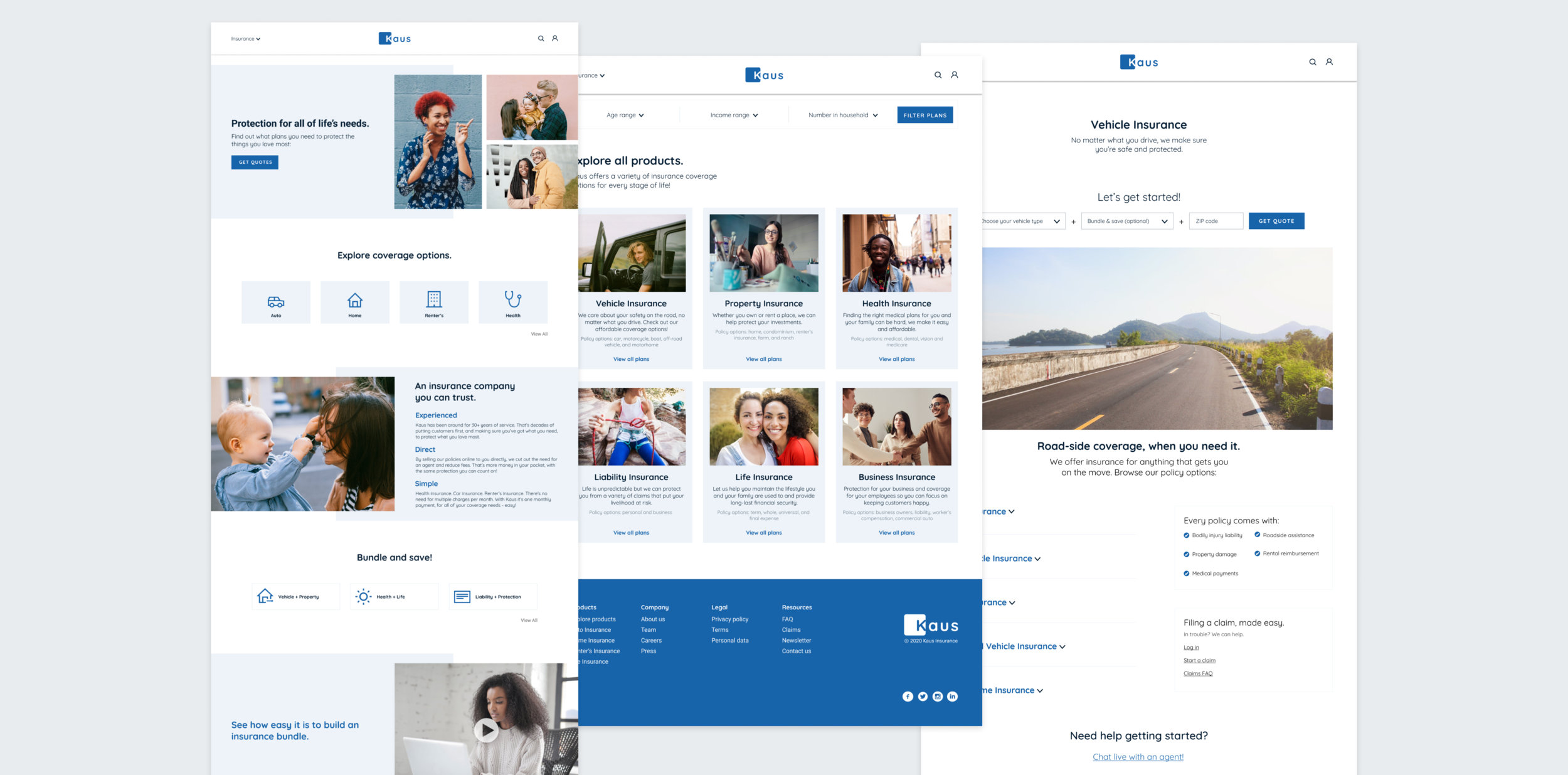
An approachable homepage
I designed a landing page that is easy to navigate and guides the user towards requesting a quote. I kept the use of color to a minimum, drawing attention to the action buttons through the brand color. I chose stock photography that would attract the target audience and suggest a wide range of product offerings.
The landing page
Helping users make informed decisions
The product page provides more details on all insurance coverage policies within that category. In order to keep information to a minimum, details are kept within an expandable menu option and there is a clear call-to-action both at the top of the page and within each of those menu options.
The vehicle insurance product page
The quote request flow
Purchasing the plan
The payment process is straightforward, and provides users with the option to make changes to plans selected, if needed. In order to finalize coverage, the user must either sign in with an existing account or create a new one.
The checkout flow
TESTING THE SOLUTION
Usability Test + Affinity Map
I conducted a usability test with 3 participants in the target demographic. They were asked to request a quote for an auto insurance policy, select a plan and checkout, using the prototype for the desktop version of the site.
Affinity Map with sorted user test feedback
Site Revisions
Problem #1: the initial photo on the homepage made users think this was life or family insurance related and not for multiple life stages, and layout hierarchy was confusing in understanding bundle packages.
Solution #1: I adjusted the order of photos on the page to suggest multiple insurance type offerings and changed the hierarchy to group anything related to bundle packages together.
v2 of the homepage
Problem #2: the filter bar in the explore page is ‘in the way’ of browsing product categories, users suggested moving it to the bottom or taking it out.
Solution #2: I provided more clarity around the function of the filter bar by adding a CTA button and adjusting the visual design and location to be less intrusive.
v2 of the product page
SUMMARY AND NEXT STEPS
Customers are making purchases to protect themselves from life events that may or may not happen. Depending on life stage, it’s not always clear what type of protection you might actually need. This creates a challenge for the business and designers alike, needing to guide the customer towards making the right choices, without overwhelming them. I tried to ease this burden through a simple, minimal site and an easy quote-to-checkout flow.
Next steps for me would include validating that the design choices I’ve made in creating a minimal quote process, are actually acceptable for generating a personalized quote. From a UI perspective, I would want to further evaluate choices around CTA button text, for example, ‘get quotes’ might not be specific enough to motivate action. I would also want to conduct more user interviews to find out what information is most relevant for a homepage, when evaluating insurance providers.
Finding the right plan
To help the user get to the information needed faster, I used a single input form for the quote request. Coverage plan options are then shown, highlighting price and high-level coverage details only, with the option to see more.