‘Gig-economy’ app
PayFavor, 2020
Mobile app concept connecting users to trusted local runners to validate a client’s business idea.

Role
Freelance UX/UI Designer
Team
Entrepreneur (client), Dev
Timeline
2-week sprint / 80 hours
Overview
Pay Favor is an app for the gig economy with the goal of connecting people that need assistance with a simple task or errand, to verified “runners” in their community. Whether it’s a quick run to the store for a missing ingredient or help with moving a heavy piece of furniture at home, the app will connect you with people in your neighborhood that are willing to help. Pay Favor is specifically for non-skilled labor requests, filling a significant gap in the task app market.
I worked with the entrepreneur behind the Pay Favor app to restructure the existing UX approach and design a prototype from the perspective of someone posting a ‘Favor request’ which they could use to shop the idea around for funding / buy in. I handled the end-to-end design process for this project: definition, concepting, sketching, wireframing, prototyping, usability testing and developer handoff.
Overview
Why are we doing this?
As part of onboarding with this client, we reviewed a project brief and brainstormed both short-term and long-term goals for the app idea, to help focus the approach during the sprint.
Short-term goal: to create a prototype for a task app with basic features, that would allow validation of app usage, engagement and feasibility, to be developed into an MVP.
Long-term goal: to have a fully functional mobile app that connects people in need of a helping hand, with a wide network of reviewed runners in their community.
The focus of this sprint was to figure out what basic features would be needed to develop a functional MVP, and to begin the process of creating a prototype, to be developed into the live product.
Lets map this out…
Though we now had a general sense for the app’s end goal, there was still no validated strategy for how to get users there or how to differentiate this from existing task apps. I was presented with initial wireframes, created by a contracted developer, but pushed for us to move back a few steps and start from the top of the design process.
I led us through the exercise of creating a task flow that started with the end goal in mind - completing a favor request. We then listed out who the customers and key players might be, and discussed the in-between steps to getting there.
Pay Favor’s task completion map
How do other apps solve this?
In order to understand how other task apps approach the same problem, I looked at a handful of solutions and captured ideas from their strengths and weaknesses.
Task apps analyzed for market research (left to right): Task Rabbit, Wage, Fetch, Thumbtack, Grabr
Many many app downloads and sign ups later, here were some of my key findings:
All apps offered a rating system and verification process.
Non-skilled tasks were one of many service categories, presenting an opportunity to differentiate ourselves by focusing on just one.
Some apps allowed both employer and employee functions to exist within one app, while others separated these into two different apps; either way, it was easy to toggle between posting and earning functions.
Let’s talk to users
I enlisted 6 total participants for 1:1 user interviews over the phone. Of these, 3 self-identified as having done freelance work in the past, and 3 were potential average users for Pay Favor. The most notable findings from my research were:
Freelancers value communication before, after, and during a job.
Freelancers were excited by quick and easy ‘penny’ jobs.
Participants found the concept of getting help from your neighbors to be appealing.
Check out the user research raw notes here.
“If you can buy a burrito with [the money earned from a Favor] and it won’t take long, that’s totally worth doing!”
A-ha! moment: after synthesizing these interviews, it was clear to us that Pay Favor’s value proposition was in being a task app for non-skilled labor that connected neighbors together for paid work. This model benefits the freelancer (quick and easy work nearby) and the person making the request (quick access to a helping hand, and more likely to trust people in your neighborhood).
Identify a Solution
Understanding our audience
Based on my findings from interviews, I created two distinct persons - employer and runner. These helped us to understand and align on our core audience.
Two distinct user personas for each type of person that might use Pay Favor
Pen & Paper
Before jumping into sketches, I started with notes. By listing out the needed app functions, and later organizing these into categories, I could begin formulating ideas for nav bar tabs and the overall UI. These initial sketches were shared with the client for feedback and to finalize a site map.
From words to sketches, early drafts of the Pay Favor UX/UI
Site map
In partnership with the client, we narrowed down the basic functionality for this app and agreed on this organization of features for an initial version of the product:
Site map for the app’s navigation bar
User Flow
I created this user flow for the two main functionalities of the app - posting a Favor and browsing open Favor jobs, and validated it with the client. I realized here that the ‘overview’ tab of the nav bar would be a central communication hub for “requests” and “runs,” and where both parties could mark the Favor as ‘complete.’
User Flow for posting a Favor and browsing open Favor jobs through to completion
Execute the Plan
Wireframes
I presented these wireframes to the client and iterated based on his feedback. It was helpful to reference these for talking through potential user roadblocks and concerns, such as:
Handling payments within the app vs allowing users to manage this externally
Allowing users to bid on completing a task at specific rates or flat rate instead
Handling location inputs for service addresses, and more…
Low-fidelity wireframes for requests and runs
Style Guide
In order to differentiate from the usual green brand color of gig-economy apps, I chose a bright shade of indigo that calls attention, in a non-intrusive way. I paired this with the minimal and friendly sans-serif font, Muli.
Brand style tile
Hi-fi Mockups
The goal behind these onboarding screens was to introduce the user to the functionality of the app and to familiarize them with terms such as “runners” which they might not immediately know the meaning of.
Pay favor’s onboarding screens
Sign up is quick and easy, and for the time being we are imagining this to be a mobile phone verification process only - further research is needed for the benefits of using other verification processes such as via Google or Facebook.
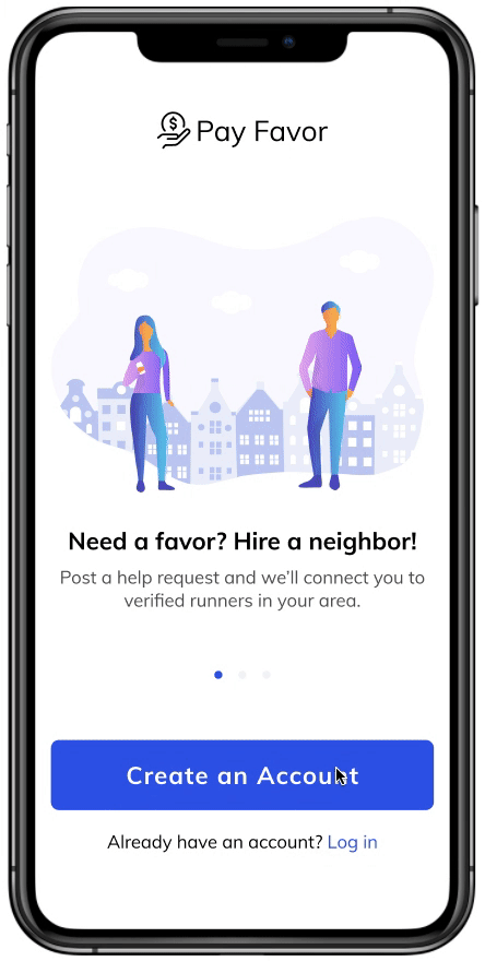
Flow for creating an account
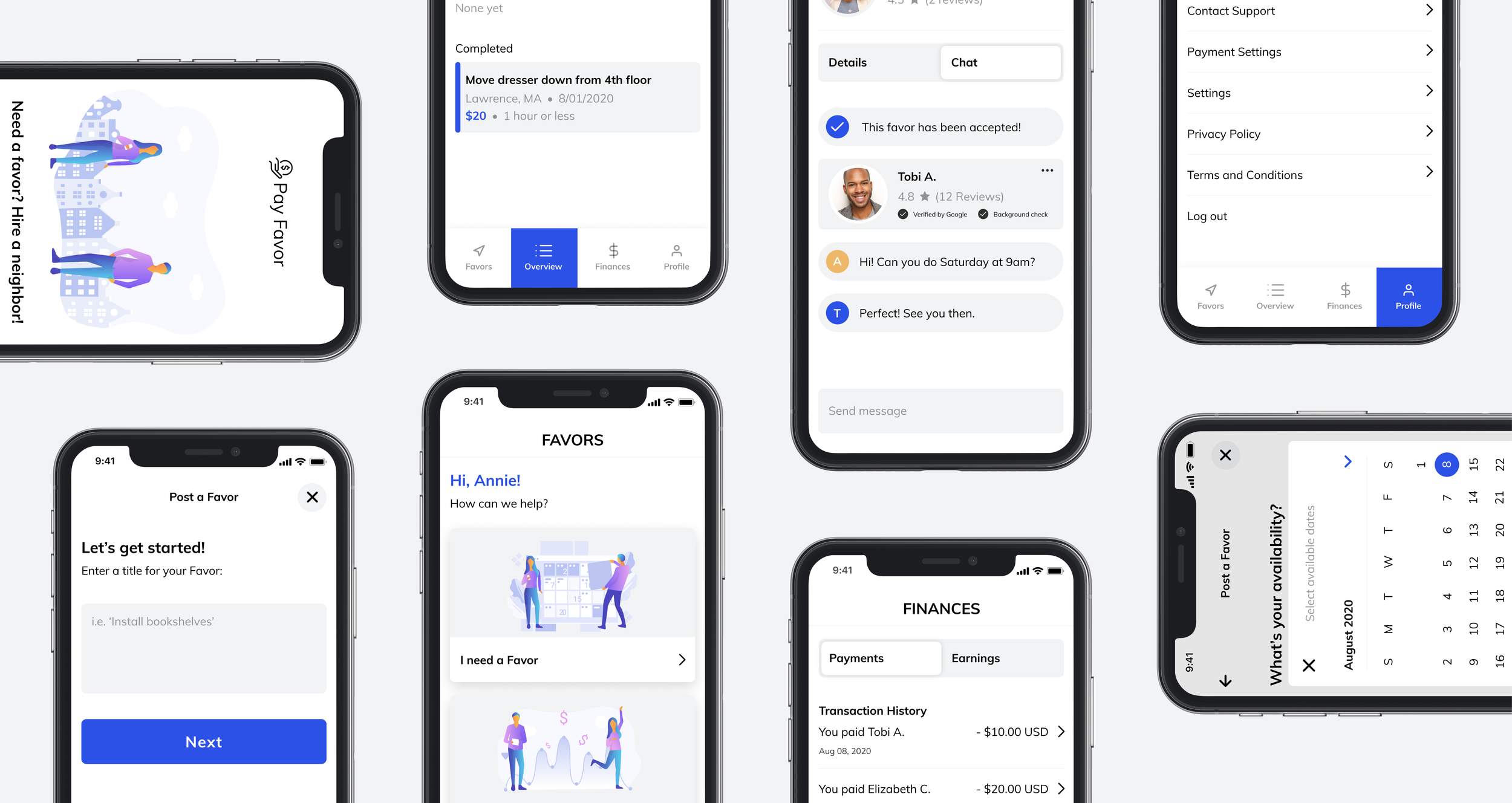
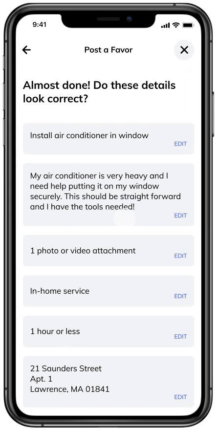
After going through the step-by-step process of building a Favor request post, the request remains “pending” until a runner accepts the request. At this point, they can chat to coordinate or iron out task details.
Interaction design for ‘Favor accepted’ state
The Favors, Overview and Finances tabs of the nav bar serve both the person adding a request and the person running a Favor request. We made the decision to allow users to easily toggle between both because there is interest in serving under either function when using the app in a neighborhood setting.
Favors, Overview, Finances, and Profile tabs
Validating our Solution
I put together a usability test plan to understand how users interact with the prototype and to find areas of improvement. Four participants were enlisted, and the test was conducted via video chat and screen share; these were recorded for internal reference only.
I sorted through these test findings and identified top revisions to focus on in the short term:
Restructure the Overview tab - users struggled with knowing what stage a ‘Favor’ was at.
Increase ‘Favor complete’ button hierarchy - users didn’t know how to close out a completed Favor.
Revisions
Revisions for understanding the stage of a Favor post
Revisions with increased hierarchy in marking a Favor complete
Prototype
This prototype runs through onboarding, initial account set up, and the user flow for posting and marking a Favor as completed. Not included in this prototype is the process for linking your bank or credit card information, what a delivery request might look like, and the user flow for browsing open Favor requests and accepting these. Try the prototype below (it’s expandable) or click here to open it separately.
Summary
Through this sprint, I was able to build out a limited prototype for the Pay Favor app from the perspective of someone posting a task request. This will be used by the client as an artifact for their business concept, as they identify if there is product-market fit. Becuase of this, there are no metrics or results to discuss, but if live, I’d be eager to dig into adoption, favor post and completion rates, and overall app ratings in the app store.
I enjoyed the feedback loop with this client, his advisor, and the contracted developer, and being able to facilitate a sprint that centered around design thinking. It was helpful to provide the team with validated data from user interviews and usability testing, especially when making the case for my UX approach. The design decisions (strategy, UX, UI) made during this sprint will become the foundation for the ongoing development of this app if it gets funded.